
the graph shows how the atom is releasing its energy
from looking at the way that the energy is released in
the graph as the atoms cool, they slowly begin to release
tiny amounts of energy @ 0 um then there is a progressively
larger amount of energy release that begins @ apx 0.2 um
that builds to the 5000 K curve in the graph.
each of the energy releases is a separate frequency in
the spectrum.
the graph only shows the blue , green and red lines
would I be wrong if I said that each of the colored lines
in the graph represented a single energy release from the
same atom as it cools and streams energy?
would I be wrong if I said that the entire spectrum of
frequencies is a continuous stream of separate energy releases
as single atoms stream the excess energy as they cool.
so that as each atom cools it is following a precise order
of energy releases that can be considered a packet of all
frequencies.
...it sounds like you're thinking of the unique electronic transitions, that are a characteristic of each element,
which create the
emission and absorption "line spectra" such as the lower two spectra below:

...so first, yes, and then no, (but see below)
on your two questions from above.===
Paul, I think
(but will defer to Orac for clarity or corrections) that your graph
is a graph representing (
the spectrum from)
a lot of atoms (
such as the sun)
...
though I suppose you could think of it as the graph of one atom, over a lot of time, cooling from the high frequencies down to the lower frequencies. 
The point though, should be that the graph represents the collective emissions from,
all the many atoms of, a blackbody (
defined as a good absorber and emitter).
Most of the emissions are at the peak of the curve, and very few of the emissions are out at the tiny tail (or head) of the curve.
The height of the curve, directly above any particular frequency listed on the x axis,
tells you how much
Intensity comes from that particular frequency.
Compared with the large number of atoms that are radiating at the frequency
of the peak,
if just a few atoms are radiating (or if many atoms rarely radiate) at some other frequencies,
then the curve will be proportionally lower at those other frequencies.
===
There is more to the story, I think, about how photons are propagated ...
as they convey and distribute energy about,
but this different perspective may help you better understand Orac's answers.
And, as Orac mentioned (on the difference between the theories)
here is something to consider ...in the long run: 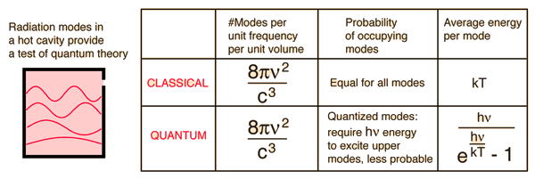
~


